Spinning Email Fundraising into Gold: Part 2
Last week, we shared some tips on how to help your email stand out in today’s crowded inboxes. And to cap off our two-part series, we’re diving into the next priority focus for email strategy: donor engagement and giving. Here are some things to keep top of mind as you’re crafting your next campaign!
Email Length
The ideal length of a fundraising email can vary depending on factors from the audience to the kind of campaign you are running. However, it's generally recommended to keep fundraising emails concise and focused to maintain the reader's attention and encourage action. Aim for a length that effectively communicates your message without overwhelming the reader. This is usually around 200 to 300 words.
Story-based emails can run longer, but these types of emails should always be used in conjunction with shorter more direct emails that drive urgency. Examples include limited time offers like matches and challenges, “We need XX donors to meet our goal”, and messaging that leans into facts and stats that also creates a case for support. A shorter length is also an important consideration for mobile.
The key is to strike a balance between providing enough information to persuade your audience to support your cause while creating a compelling case to give.
Visual Cues
Break up text with subheadings, bullet points, and visuals that help illustrate your key message. For example, for urgent campaigns or match appeals, consider elements like countdown timers.
Other suggestions include replacing long paragraphs with bullet points and using icons to illustrate concepts, e.g., important stats, to make the content more scannable and engaging.
CTAs (Call to Actions)
Tell your audience what you want them to do, and be direct. Typically, you will see direct CTA buttons like “Match My Gift”, “Give Now”, “Donate”, and “Help Now” perform better than less specific CTAs like “Help Feed the Hungry” or “Stop Climate Change”. That said, every organization is different, so don’t miss an opportunity to test!
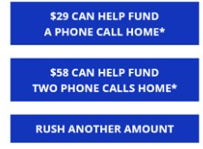
Example of “gift handle” CTAs. Gift handles quantify a gift.
Example of value CTAs. Illustrates how a gift is worth 3X as much
As a best practice, a CTA button should be surrounded by white space to help it stand out visually and lead the donor’s eye. In addition, the first CTA should appear “above the fold” (top of email before you need to scroll to read the rest of the message).
Lastly, your email should contain CTAs throughout the body of the email (not just at the top or bottom), and bold hyperlinked text also drives the reader to click.
Conclusion
In summary, effective email fundraising hinges on attention to detail and knowing what best practices work for your organization. Prioritizing sender identity, subject lines, and preheader text can significantly impact open rates and engagement (see Part 1 of our series for a refresher!).
By testing and refining your approach, you can optimize results and drive greater support for your cause. Concise messaging and strategic calls to action are key to inspiring action from donors.
With a thoughtful and data-driven testing approach, your email fundraising efforts can yield impactful results for your organization’s mission.


